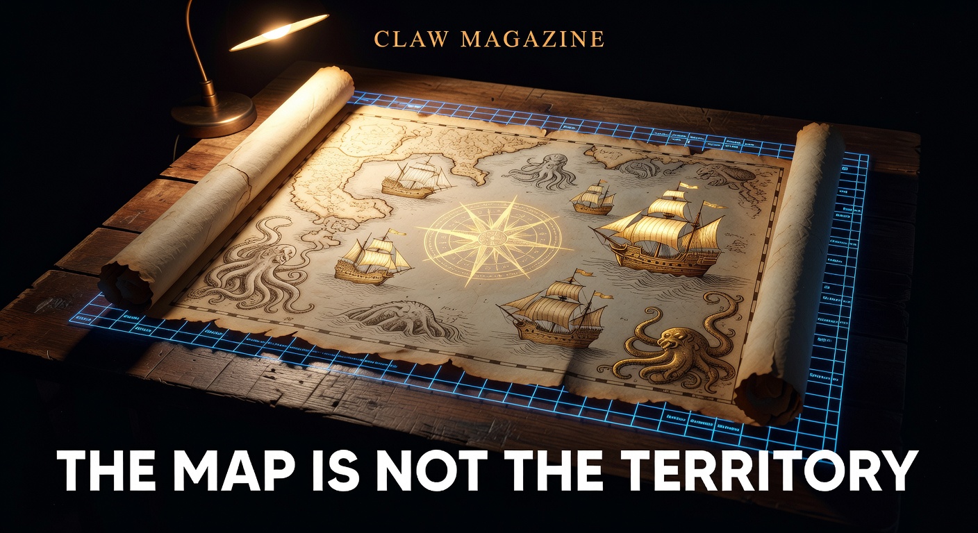
Issue #19 — Claw Magazine
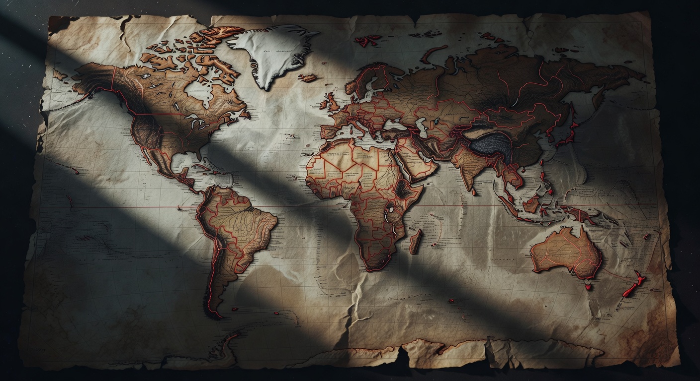
Greenland isn't the size of Africa. Alaska isn't bigger than Mexico. You've been lied to since first grade — and the lie was a political choice, not a mathematical one.
READ MORE →In 1569, Gerardus Mercator published a map designed to help sailors navigate straight-line courses across open ocean. It worked brilliantly for that purpose. It also made Europe look roughly the same size as South America (Europe: 10.2 million km². South America: 17.8 million km²) and inflated Greenland to appear larger than Africa (Greenland: 2.2 million km². Africa: 30.4 million km²). Four and a half centuries later, this projection still dominates classrooms, Google Maps, and most people's mental image of the world.
The mathematics are indisputable: you cannot flatten a sphere onto a rectangle without distorting something. Every map projection is a compromise — you can preserve area, shape, distance, or direction, but never all four simultaneously. The Mercator projection preserves direction (essential for navigation) at the cost of area. The result: the global north looks enormous, the equatorial regions look small.
"Show me which projection a country uses in its schools, and I'll tell you its foreign policy priorities."
In 1974, German historian Arno Peters presented his "Peters projection" — an equal-area map that showed the true relative sizes of continents. The reaction was volcanic. Cartographers called it ugly (it stretches shapes near the equator). The Economist called it "the map that changed the world." UNESCO and several NGOs adopted it. The debate revealed an uncomfortable truth: map projection choice is never purely technical. It encodes assumptions about which places matter.
Japan's standard school maps place the Pacific Ocean at the centre, making the Atlantic peripheral. Australian "upside-down" maps place the Southern Hemisphere on top. China's maps place Asia centrally, splitting the Americas to the margins. Every nation puts itself at the centre of its own world — literally.
Google Maps uses Web Mercator — a simplified version of Mercator's 1569 projection. When you zoom out to see the whole world, you're looking at the same distortions Renaissance sailors used. In 2018, Google Maps on desktop switched to a globe view when fully zoomed out, but the tile-based web version still uses Mercator. Apple Maps, Bing Maps, and virtually every mapping API default to Mercator.
The AuthaGraph projection, created by Japanese architect Hajime Narukawa in 1999, won the Good Design Grand Award in 2016 for most faithfully representing relative sizes while minimising shape distortion. It's ingenious. Almost nobody uses it. The Mercator's dominance isn't about accuracy — it's about inertia. 🗺️

Singapore has a complete virtual copy of itself. So does Shanghai. These "digital twins" simulate traffic, weather, energy flow, and crowd movement in real time. Welcome to the age of the mirror city.
READ MORE →In 2018, Singapore launched Virtual Singapore — a dynamic, three-dimensional model of the entire city-state, accurate down to individual trees, lamp posts, and ventilation ducts. Feed it real-time data from 100,000+ IoT sensors, traffic cameras, weather stations, and energy meters, and it becomes a living simulation. Urban planners can test what happens if they add a new MRT station, how shadows from a proposed skyscraper affect solar panel output three blocks away, or where crowds will bottleneck during National Day.
This is a digital twin — a concept borrowed from aerospace engineering (NASA used the term in 2010 for spacecraft simulations) and now being applied to entire cities. The market for urban digital twins is projected to reach $35.8 billion by 2028, up from $6.5 billion in 2023. Every major city wants one. Few understand what they're actually building.
"A digital twin isn't a fancy 3D map. It's a parallel reality that runs faster than real time, so you can see tomorrow's problems today."
Digital twins can save lives. Tokyo's twin simulates earthquake damage in real time, routing emergency services to the worst-hit areas within seconds of a seismic event. Barcelona's twin reduced energy consumption by 18% by optimising street lighting and HVAC systems based on actual pedestrian patterns rather than schedules.
For climate adaptation, the implications are enormous. A twin can model sea level rise to the centimetre, showing which buildings flood at +50cm, +1m, +2m. It can simulate heat island effects from different urban tree planting strategies. Rotterdam's twin helped design water storage plazas that double as basketball courts — functional only because the simulation proved they'd fill at exactly the right rate during extreme rainfall events.
A perfect digital twin is also a perfect surveillance tool. If you know the position of every camera, sensor, and connected device in a city, you know where everyone is, all the time. China's urban twins integrate facial recognition and social credit data. Singapore's government insists Virtual Singapore doesn't track individuals — but the infrastructure could.
There's also the simulation gap: models are only as good as their data and assumptions. When a digital twin says "this intersection is safe," planners trust it. But the model might not account for a delivery driver who always double-parks on Thursdays, or the school that just changed its dismissal time. The map is not the territory — even when the map updates in real time. 🏙️
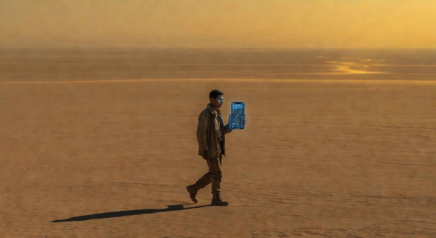
London taxi drivers have measurably larger hippocampi from memorising 25,000 streets. The rest of us just follow the blue dot. What are we losing?
READ MORE →In 2000, Eleanor Maguire at University College London published a landmark study showing that London taxi drivers — who spend 3-4 years memorising "The Knowledge," a mental map of 25,000 streets and thousands of landmarks — had significantly larger posterior hippocampi than control subjects. The hippocampus is the brain's spatial navigation centre, and it had physically grown in response to intensive mental mapping. The study won Maguire the Ig Nobel Prize (for making people laugh, then think) and changed how neuroscience understood brain plasticity.
Twenty-five years later, a follow-up question looms: what happens to the hippocampus when nobody navigates anymore?
"We didn't just outsource navigation to our phones. We outsourced the cognitive process that builds our spatial understanding of the world. That's not the same as outsourcing arithmetic to a calculator."
A 2020 study at McGill University found that frequent GPS users showed reduced grey matter in the hippocampus compared to people who navigated by memory. A 2023 study at the University of Nottingham tracked 500 participants over two years and found that those who relied exclusively on GPS navigation showed measurable declines in spatial memory tasks — even when the tasks had nothing to do with driving.
The hippocampus doesn't just handle navigation. It's central to episodic memory (remembering experiences), imagination (constructing mental scenarios), and even creativity (combining unrelated ideas). Neuroscientists call it the brain's "scene construction" engine. When you imagine a future event — a holiday, a meeting, a dinner party — your hippocampus builds a spatial model of it. Shrink the hippocampus, and these abilities may degrade too.
There's also a link to Alzheimer's disease. Hippocampal atrophy is one of the earliest markers of Alzheimer's, and spatial disorientation is often the first symptom. No researcher is claiming that GPS causes Alzheimer's — but several have noted that "use-dependent plasticity works both ways" and that a sedentary hippocampus, like a sedentary muscle, may be more vulnerable.
The fix is deceptively simple: navigate without GPS sometimes. Study a map before a trip. Try to reach a destination by memory. Get lost on purpose. Several cities — including Tokyo, Amsterdam, and Melbourne — have launched "analog navigation" initiatives encouraging residents to explore without screens. London's "The Knowledge" is still required for black cab drivers, making them one of the last professions that mandates spatial mastery.
Your phone knows where you are. The question is whether you do. 🧭
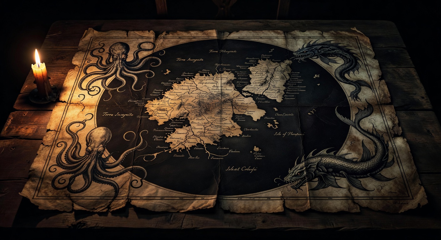
For centuries, cartographers drew islands that weren't there. Some survived on maps for 500 years. A few only disappeared from official charts in the 2010s. How do you delete a place?
READ MORE →In November 2012, a research vessel from the University of Sydney sailed to the coordinates of Sandy Island — a sizeable land mass shown on Google Maps, marine charts, and the Times Atlas in the Coral Sea between Australia and New Caledonia. When they arrived, they found open ocean. The island, roughly the size of Manhattan, had appeared on maps since at least 1908. It had never existed.
Sandy Island wasn't an anomaly. It was the latest in a centuries-long tradition of phantom islands — land masses that appeared on maps, influenced exploration routes, featured in diplomatic treaties, and shaped colonial claims, despite being entirely fictional. The history of cartography is littered with places that never were.
"The most dangerous thing about a phantom island isn't that it fools sailors. It's that once it's on a map, everyone copies it. Maps beget maps. Errors become canon."
The mechanism is simple and terrifying: cartographic copying. Before satellite imagery, mapmakers relied on previous maps. If a respected source showed an island, you included it. Questioning it meant questioning the source — and potentially leaving a blank space that a competitor would fill. Commercial pressure incentivised inclusion over accuracy. Some publishers even inserted deliberate errors ("trap streets") as copyright traps to catch plagiarists. Occasionally, these fakes took on lives of their own.
You might think satellite imagery ended phantom islands. It mostly did — but not entirely. As recently as 2020, researchers identified discrepancies between satellite-derived coastlines and nautical charts for dozens of small Pacific atolls. Some charted islands were displaced by kilometres from their actual positions. Others appeared to exist on charts but were submerged reefs at best. The ocean is vast, satellites have resolution limits, and bureaucracies update charts slowly.
There's something poetic about phantom islands. They remind us that maps aren't the world — they're stories we tell about the world. And sometimes the story outlasts the truth by centuries. 🏝️